

Hmmmm - when I suggested to add text to the banner @frabrunelle mentioned the implications of different screen sizes… And I think he was right there - might get tricky to make this looking good on all platforms ![]()

@Suriana I’d be curious to see a version of this one without the “SAFE” text, just the “Secure Access For Everyone” (without a dot at the end) and maybe the logo too (like in the version below)
Also, the “Secure” is a bit hard to read because of the background (especially between the “c” and the “u”) so maybe it could be moved slightly so that it’s more visible.

This one looks great! I think it might look even better if the “Secure Access For Everyone” was more centered.

I also like this one. I would be curious to see a version without the “SAFE”.

This one is almost the same as this version I tried above. The difference is that the logo and the text are moved slightly up. I think it looks great!

I also like this image for the footer ![]()


Yes, I prefer the top one too! It looks great ![]() It might be worth moving the text slightly up but even like that I think it’s probably fine.
It might be worth moving the text slightly up but even like that I think it’s probably fine.

This one looks good too but I think the text should be moved slightly up. Also, it might be worth removing the period at the end of “Secure Access For Everyone”.

The text in this one is a bit less readable because of the background. I don’t like it as much as the others.
Maybe we could do a poll between @Arcturus’s image and the first two images above (I’m not sure if the third one is worth including?). Should other options be included? Please let me know what you all think ![]()
Yea, agree on skipping the last one. Will adjust nr 2 later tonight.
Sure, a poll would be great ![]()


Looks very nice, although it depends on the browser scale you use. For me, the reddit text overlays the logo/SAFE text as here:
If I zoom the browser scale out x3 (below), it looks great, but that makes the content far too small for me:

If it could be a bit deeper the reddit label would never obscure the text at whatever screen size / resolution.
Hi,
Do you mean, the text/logo being resized to smaller size?
Maybe - not quite sure what size range Reddit allows TBH. The issue is that when the screen size is smaller, the Reddit tag “moves across” to cover part of the text in the graphic. So I was thinking either make the graphic deeper (ie increase the height of the graphic to lift the text out of the way), or, as you suggest, make the test slightly smaller so there is no overlap.

@frabrunelle Try this.

Looks good on my screen ![]() What does it look like for you, @happybeing?
What does it look like for you, @happybeing?
You can test by zooming your browser in /out (Ctrl - + / Ctrl - -). I’ll check when I’m at my laptop.
Is it possible just to increase the height of the banner instead, or is that limited? Then the headline text could stay more central.
Yes, it’s possible to increase it. For example, it can be increased to 294px by using this addon.
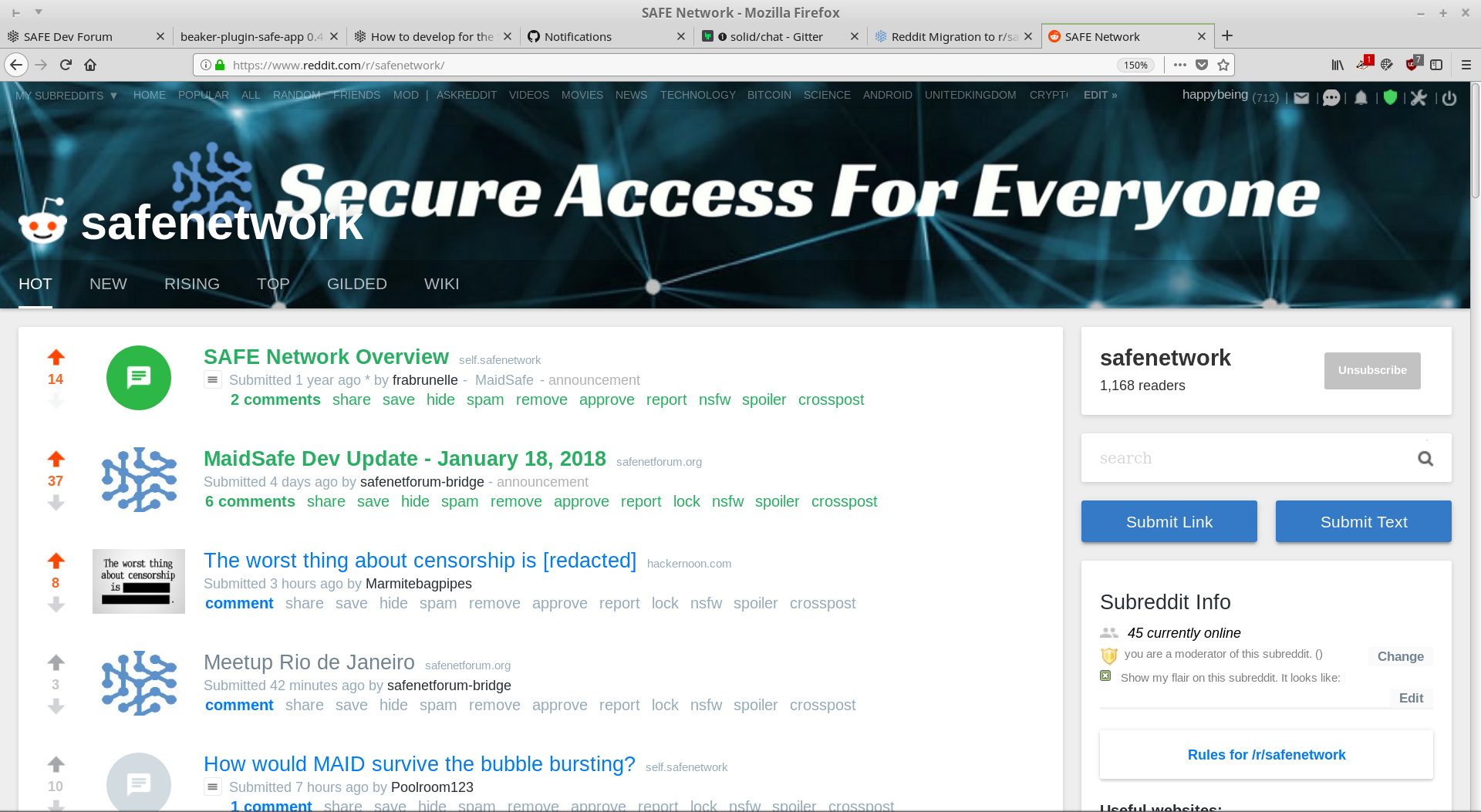
It no longer clashes ![]() The headline would look better centred. I guess its a trade off between that and screen real estate. Here’s the current look:
The headline would look better centred. I guess its a trade off between that and screen real estate. Here’s the current look:

Good job. Thank you. I think i will register i reddit account just for safenetwork.
No new proposals? Should we try addons with different sizes or is 1920x196 OK?
Is it time for a poll? ![]()