What? Are you joking?
Now that you mention it. I see a key
It wouldn’t take much to make it more obviously a key, and the circle could be given light meridian lines to make it a globe.
1 Like
But then just that hint of a key is sufficient without imposing.
Those were just randoms from the submissions I think that at least 1 great text based logo should be included in the poll.
I for sure am suddenly finding them a breath of fresh air
1 Like

I like it too. I think there is too much going on though, i’d like to see it simplified. I would probably remove most little pieces that goes flying in all direction.
There’s also this variation 326 with an hint of self-encryption in it.
1 Like
@DavidMtl I actually though it could be animated if in a commercial etc. like it’s coming from all directions, out of the ether (no pun intended from the crypto space) and all conjoinging into this artistic atom
Honestly do we want a friggan lock? Like that’s what it stands for, it’s sole purpose is security but security really comes second to the what it’s securing which is humanity and humanity’s ideas. More reason I like this abstract direction that connects on a more personal level
2 Likes
Probably my favorite thus far. +1
I think this is my favorite Shield type 431.
It’s simple, dynamic, the little nodes are kind off like protecting the shield. Would work well as an icon.
This was easier than I thought, especially once I’d ruled out the padlock theme. I really would like it to be a symbol that expresses open connectedness, but with a secure aspect.
529 is simple but quite cool.
316 was my favorite till I saw the alien in the helmet. ![]()
300 may my personal favorite. It’s really simple and subtle. The “key” made from the F and O sneaks up on you. Only problem is that it lacks a symbol that can stand alone.
So I think number 2 stands out as the best.
3 Likes
It looks too much like the Electrum Bitcoin wallet logo I think. And the bit at the top right looks like the top part of the Apple logo.
1 Like
Of the shields that one is my favorite as well, but like someone else mentioned shields = anti-virus software to me.
2 Likes
@Krekc I thought it was just me but I totally saw the apple leaf in there. I still like it though at least that direction. Hope more like that pop up. I have not seen electrum wallet logo yet I’ll check that out
The submission period is closed, so unless we ask designers to create one like it specifically that won’t be the case. I think making it less crowded will actually make it look more like the Electrum logo.
I like the idea of spread wings; I might play with that a bit if I get a chance. Random characters or bits might be hard to incorporate without adding too many small details, though.
1 Like
The key shape is kind of like the arrow in the FedEx logo: very subtle, but still able to effectively convey meaning.
1 Like
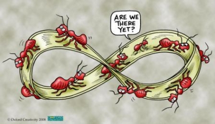
I came across this gem: https://shewonk.files.wordpress.com/2011/09/mobius_ants.jpg
3 Likes
Unfortunately missed the last 24h therefore I share my design out of contest
The idea is largely taken from the ant metaphor (also: connections and exchange) and underground ant colony building in particular:

I was inspired by colony building long time ago. Some of you may already know it, but I thought it´s wotth sharing if you are interested in ant colonies in general:

7 Likes
actually number 592 is growing on me… looks like 3 people coming together forming a shield.
i’m not too keen on the whole lock/key/keyhole thing. 10 years from now nobody will know what that is anymore because locks/keys will probably look completely different.
At first I agreed, but I gotta say I am very glad we opened it up in the end. Just going through the latest submissions now, I see that there is a lot more variety and interesting novel ideas about how to represent it – though clearly not executed that well.
Like these ideas to represent safety as “shelter” rather than “protection” (padlock and shield) – like the sheltering symbolic of 585, 475 and 420, the umbrellas of 584 and 569 or the heart-pad-lock of 577. I like that idea, it is much more compassionate, human and open rather than the defensive and blocking idea of “protection”. I think that’d be a representation worth investigating (but given: none of the current version is really doing a great job yet).
Or the novel approaches in representing network in combination with people but also in protection. Like the key hole surrounded by people of 529, the SN-network protected in a box of 533 or as a box in 428 , the network in the padlock of 525 (and the same as a “globe” in 488), more key hole in a network (like 405, 415, 493, 416, and 512). Other person network combinations like 495, or new approaches to somehow marry all these aspects, like the user icon wifi padlock of 504.
And my personal favorite (though not a great pick): Don Quixote – not a joke, we are fighting windmills ![]() .
.
1 Like