I get it to - I like the idea, but the execution is little uninspiring. The key hole, though a good idea, is too small, and I keep seeing it as light bulb instead. Couple of ideas:
More variety in the shapes, and a little more movement - its a little too static and stuctured.
Edit with More ideas:
Experiment with less structured mesh network representations. Vary size of nodes. Leave a line hanging, attached to only 1 node.
I like the ant and the electrodes (I think that’s what they are called, but English is not my first language). The wings I don’t like, it makes the image too detailed I think. Perhaps a variation without the wings and a way to highlight the encryption/security aspect of the network?
If you don’t submit on 99designs you won’t be competing for the reward for the competition. The design can be included in the forum vote though (if chosen as one of the top designs), but we have to declare a winner on 99designs for the competition there.
Perhaps another forum member that is listed as a designer on 99designs would be willing to submit it for you (if he/she welcomes the competition )
Yes we opened up the contest to non platinum designers for the last 24 hours to enable participation from those within the community. I agree that there has been a noted drop in standard, but we kind of figured that would happen. However, the network is about inclusion and it is important that the people who have supported us on this forum were given the opportunity to take part.
That’s fine: I’m mostly just trying to throw out some different design ideas rather than to submit a winning design anyway.
I definitely agree about the level of detail of the wings, but they’re light enough that at smaller resolutions they blend in with the ant body/background so that the logo still works even if it’s too small to see the wing details. I like the symbolism of the wings, though: wings are a standard symbol of freedom, but their mesh design is also representative of the large network of nodes that the SAFE Network needs to have in order to get off of the ground (so to speak). Before those I did also look at adding a keyhole symbol to one of the segments of the ant’s body and/or adding a set of pincers styled to look like a padlock shackle, but those didn’t really fit. There’s also already more than enough padlock/keyhole designs, so I didn’t think we really needed another one.
My vote – for now – goes to #6 (user-icon in padlock). It is clear and distinct and really the first one that really put the “person” into the aspect of “safe”.
I am not a fan of the padlock in general, but it is a distinct symbol for crypto and “internet safety” (just look up to your left next to the address bar), so it has all the right associations. The other idea of using a “shield” just reminds me too much of an anti-virus company (they’ve kinda been taken that one). I wouldn’t know of any other good symbol to represent that.
That said, the logo lacks both the “network” aspect of it all and
THIS ^^ . All of them severely lack that this project is ultimately about the people.
There are a few which put a group of people into the padlock (like this and this – my favorites out of that list, but still too crowded) while others combine padlock and network (or only network). But there are few that combine any of these aspects nicely.
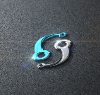
Raising the question if it wasn’t better to go more abstract (as discussed prior). There my favorite is 69. You could still see the user-icon in the shape, but it has almost no connection to any other aspect. Which most of the abstract ones have. Making them a little too 90th-big-corp-holding-company to me.
A suggestion for the wings could be to spread them instead of having them rested on the body? As for the encryption part when you Google the word Encryption it seems that 1’s and 0’s or a bunch of random characters seem to represent encryption (as well as the padlock). Perhaps it would be possible to work that into the body of the ant?
I was thinking about those breaky stripes in 69 a lot before. And while it appeals to me from a aesthetic perspective I think it’s neither good to represent a network (does it give you that association at all? Or it is through the association of the WiFi-Logo? – it is a leaky ripple from the core … how is that a “network”?) nor good in a logo at all. A logo should be distinct, easy to spot even from a far or when zoomed really small. The more “detail” the logo has/needs to stay distinct the harder this is for people to recognise it. That’s also why you’ll find the 0-1 thing a lot for big newspaper-imagery and background pictures but not in logos. A good test is always: how often does an amature have to take up their pen to draw it – and do people still recognise it. That’s where the nike-swoosh is soo damn good.
I like #6 because it is distinct and easy. You could draw a padlock and leave out the outline of a person on the bottom even with the drawing skills of … a person like me … and people would still recognise it. Adding details makes it much harder.
I am wondering if we could ask them to do some “network” structure in the background. similar as some others did… or if that also becomes to cluttered and detailed-ish…
Too busy, too many locks. Difficult to discern details when used as a small icon. Creative, though, something that is missing from the submissions on 99Designs.
So far I like #31 the most. Playful, modern, simple, still it contains the S and on a smaller scale it still stands strong. And I can already see jewelry and promo material with this logo:
I still like #6 best so far, but it’s not really the one is it?! We’re better than that imo.
I’m beginning to think perhaps we should have gone for a more emotive and abstract brief… freedom, empowerment, unity etc.
I guess it’s not surprising they all think we’re just another company with a product we want our customers to know about. But we’re not really are we?! SAFE will belong to everyone and it IS digital freedom, not a product we want you to buy to protect yourself. When I think of SAFEnetwork I think of wings and links, I think of unity, borderless, censorless, leaderless and incorruptible, all these exciting things that inspire me and make me want to be involved. I don’t think of a padlock or a shield.
I would love to see more abstract attempts to capture the more subtle implications for the network, which are what actually get us all excited.
Perhaps we should run it again with a more arty and abstract brief about what we wanted the symbol to encapsulate, rather than explicitly what the network does?
I think bluebird hit the nail on the head too, we may not have the design skills, but we are probably best placed to guide the designers by throwing words and ideas at them to get a much broader and wilder range that the 500 different locks we seem to have here.
What’s a little annoying is that the design brief was available for us all to influence. Yet none of us saw the barrage of locks and shields coming. Face palm.
We’re going to go through all the designs tomorrow. As we have only just finished the qualifying stage we may be able to adapt the brief to look for something a little more different abstract. So potentially we pick the 6 best designers and amend the brief. I will need to see what 99 Designs have to say about this though.
At first submissions as these made little sense to me. Now I am thinking perhaps they are the logical approach when the product is too complicated to brand with an image.