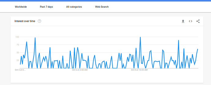
I’m more interested why my output with the same parameters is so different. I mean, the upswing is there, China is on top for me as well, but the curve doesn’t look too similar. I’ve been using GTrends for a while now, but began experiencing fishy stuff lately.
EDIT: On second glance, the chart is almost if not entirely identical, but with different amplitudes?
EDIT: I encourage more people to look up MaidSafe on Google Trends and post their results for comparison.
