 hexagons everywhere
Nah, it loses the Muslim vote. ![]()
and mine /fillfillfillfill/
How about a Hexagon Mood Board?

3 Likes
Also think that one should be considered
1 Like
well there is to much geometrical forms
This is my favorite so far: I think its bold and original.
1 Like
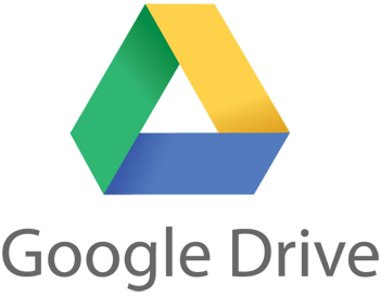
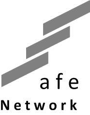
By the way, notice this logo’s resemblance to Maidsafe’s - similar market niche, very similar logo. Which came first? If Google Drive came after Maidsafe (and after its logo) then it might be a solid case for infringement:
1 Like
14 posts were split to a new topic: Disappointed with choosing 99designs
What about something like this? If anyone with design skills likes it please feel free to run with it.
#609 is my new favorite.
SAFE network will be the de facto way the world of people connect.
1 Like
I’m starting to like 609/617 more and more.

There’s something very powerful about quirky, odd and memorable… I imagine people telling each other to look for that funny little icon with the dude with lines shooting out of his head. Or an exhausted IT guy telling someone to look for the blue shield with all the dots and lines on it. It makes me smile and I like the idea of people remembering and noticing it. It is distinct, I can’t think of anything else quite like that lol.
EDITED pic to 609 from 617
1 Like
It looks like a face, and a very unsettling one at that… If it had a slogan it might be “my mind in a cage, and I must scream…” Edvard Munch would approve.
Boo to you sir, i think it looks really cute/appealing which is hugely important. I guess beauty is in the eye of the beholder though ![]()
well all logos from sheva look way better than any of the others. Imho this designer plays in a whole other league than the others … I would pick one of his or work more closely together with him for a little more cash …
6 Likes
Once they see that the dot in the center is a big round nose and the blob at the bottom is an open mouth, they won’t be able to forget it. The other four dots and their squarish connecting lines look like an iron construction of struts wrapped around that poor being’s brain.
1 Like
At the end of the day, no one will discuss a hexagon or an ‘S’, so they are less likely to remember the logo itself, but a lot of people will scratch their heads and ask, what is up with that little dude and what is going on in that logo with the radial lines coming out of his head? I think the weird and appealing qualities of it help it serve its purpose - it needs to stand out and be remembered. There isn’t much chance of the logo telling you much about the product, it’s more about identification than explanation. Remembering it and noticing it are what matters when it comes to helping identify it… I won’t be forgetting that logo, it’s odd, I love it ![]()
2 Likes
I’ll say this for it, it is memorable, which beats the triteness of endless blue ants and padlocks.
But then so is Fifi the saucy French Maid. ![]()
1 Like
![]() Now that would get my vote
Now that would get my vote
It should appeal to your cynical side really ![]()
People are idiots, just give 'em something clear that they will notice and remember and doesn’t make the network look stupid.
I think this just about satisfy’s the last criteria…?! Although it is walking the line of french maids I grant you.
1 Like