I like that. Personal contacts give the possibility of something extra. I know the guy who did the designs for the London Tube (Metro) which have been appearing across the city over the last year. He’s just a one man band, so might be too busy with that (and follow up), but when we have something to look at I can ask if he’s interested. He owes me some favours too ![]() See http://robdurkin.co.uk/ and click on Illustration
See http://robdurkin.co.uk/ and click on Illustration
2 Likes
I meant to reply here earlier, so my apologies for being a little late. Anyway, I just wanted to add a couple of brief comments:
I understand that the forum logo (the blue-orange-and-green pseudo-Penrose triangle) probably isn’t intended to be used as a main logo for the SAFE Network. Regardless, I thought it might be worth noting that it does bear some similarity to the logo for Google Drive, which arguably competes in a similar area.
As for @nowfeelsafer 's logo, I have to say I really like it. I think you did a really nice job with it.
1 Like
This kind of inspired me here so I’m going to run with it. What if we did something like just let people make logos that represented maidsafe to THEM and then put them all up. Next step is when someone new came along they could take a look at the list and see if the symbol/icon/design they had in their head had already been created or if they wanted to create a new one. The maidsafe foundation itself could just stick the most popular symbol up on it’s website. So whatever resonated with the most people would be “The One” that got stuck on the site and all the merchandise BUT there’s nothing to say that that couldn’t change as different symbols might become more popular or resonate with different people. In this way it would also be possible for maidsafe to at times change their “theme music” just like many television programs and animes do. Having the same Iconic Symbol forever isn’t always a good thing, it can get boring. Compare the windows symbol of today with the windows symbol of 1995 for instance. Yeah it still looks vaugely like a window but it’s changed dramatically. Perhaps all we’ll keep of Safecoin is the word or the S and all the rest will change subjectively.
A symbol can have divergent meanings of ideas to different people but DIFFERENT symbols can also have CONVERGENT meanings of the same idea to different people. Maidsafe will mean a lot of different things to different people and it therefore follows that the icons that represent the SAFE network will also have different icons to portray those subjective concepts. The important point for the community is does a particular symbol resonate with a particular portion of said community and if so by how much?
2 Likes
What about having a vote on new symbol?
First, a person sets up a vote; yes or no on a new symbol. If all says aye, then it proceed to stage 2 voting, vote for a new symbol. This vote only can be called once a year to limit interchangeability confusion.
Why not just have a logo repository like for any other file. “Hey keep up to date on the latest logo at our new Github repository! Make sure your t-shirts are never out of date!”
I think there is a natural evolution of iconic symbols - they don’t change massively, otherwise it would be counter-productive. If your logo has achieved “iconic” status, then it would make no business/marketing sense to change it.
I think a similar selection process to the one you suggest (though quite limited in entrants imo) has already been done to arrive at the present symbol.
I have no problems with doing it all again to see if anything good pops up myself - as symbol does not have iconic status.[quote=“Blindsite2k, post:23, topic:6003”]
but DIFFERENT symbols can also have CONVERGENT meanings of the same idea to different people.
[/quote]
Can you illustrate this point by providing an example? Not quite grasping it. ![]()
OK…[quote=“Blindsite2k, post:23, topic:6003”]
and it therefore follows that the icons that represent the SAFE network will also have different icons to portray those subjective concepts.
[/quote]
Nah…sorry, you’ve lost me…I think I need an example. Do you mean like a symbol for privacy, a symbol for Security etc?[quote=“Blindsite2k, post:23, topic:6003”]
The important point for the community is does a particular symbol resonate with a particular portion of said community and if so by how much?
[/quote]
Each special interest “portion” chooses it’s own symbol -right? How many symbols in total? I think you are suggesting various “club” flags aren’t you?
Noooooooooo…tell me it’s not this!.. ![]()
So, just to be clear.in a thread titled "One Symbol to Rule them all - your suggestion is “All symbols to rule the one”…just checking…lol?
∆ It would make a ∆ difference ∆ if we could have a html entity symbol ∆
Certainly. Let’s take the idea of “healing” as an example.
This is a symbol for healing:

And this is a symbol for healing
And these are symbols for healing…
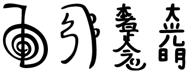
And THIS is a symbol for healing
They are all very different but they all mean the same thing and are associated with the same idea. Now if you break each one down into specific details they might mean different kinds of healing but they still mean the same core idea. And like any other translation changing one symbol to another, changing one language to another, some meaning can be lost especially if you don’t know the context or subjective meaning.
No I mean each person would design or select a logo that most represents what SAFE means to THEM and embodies their subjective values about the network. Should SAFE be depicted as a trinity of Privacy, Security and Freedom? If so a triangular shape of some sort would be implied (SAFE triforce perhaps?). Or does one envision the decentralized interconnecivity of SAFE more in which case perhaps some kind of symbolic net, mesh or grid pattern would be called for. Does one focus on SAFEcoin when one focuses on SAFE, in which case the design would be around that of their image of the coin and most likely circular. Or one might do a coat of arms with a shield design or any number of things. The point is what does SAFE mean to the individual? And much like any other set of symbols if one makes their own design and it remains obscure then others aren’t going to know what it means without it being associated with more common well known symbols that mean the same thing or an outright explaination.
They COULD do this but more than likely as people are bloody lazy and not everyone has decent graphic arts skills they’d just look for symbols that have already been made and adopt them. Let’s say there are 10 symbols out of every 100 people. 9/10 people can’t or don’t want to be bothered making their own maidsafe logo. So they just do a search for one, look through the gallery or whatever and say “hmm I like… that one!” And stick it wherever they need it. In this way it becomes a form of democracy by participation. Creators become the candidates and the art consumers become the voters. Then you simply do some analytics to determine which symbol is used the most often and you’ve got your one symbol to rule them all.
2 Likes
Personally I like the forum logo… It’s fresh and light in my opinion.
5 Likes
Since that is the case why not use a modified version of the safecoin logo as the network logo? Better yet have another design contest!
3 Likes
I was looking at the screen captures of the the launcher from the last blog post, and really clicked with the hexagon shape of its icon, that we can interpret as a honeycomb.
![]()
It is certainly not a coincidence (@scott could tell us) and I think it is a great idea because a beehive shares similarities with what the SAFE network aims at becoming. Which had me spend a few hours on one of my favorite topics, thinking about icons ![]()
To elaborate a bit on the analogy:
To the beehive / network,
- each cell / node is an essential supporting element of the whole structure.
-
A cell does not hang in the void, it is connected to others and others are connected to it. -
Take out enough of them, and the whole structure collapses. -
Its role as a supporting element does enable to distinguish one from the other. What make it different is located inside the honeycomb, where user can safely store its personal data.
The inside of the honeycomb / user’s perspective,
- This is a delimited space, isolated from the outside, auto sufficient,
-
From inside, one cannot see the whole beehive, and can at most get a partial perceptions that some things happen in his surrounding cells.
I am aware that this is not a perfect analogy, but at least it works for conveying a few ideas through an icon.
So there again I started to think about what a SAFE Network icon could look like, and here are some tests from oldest newest :
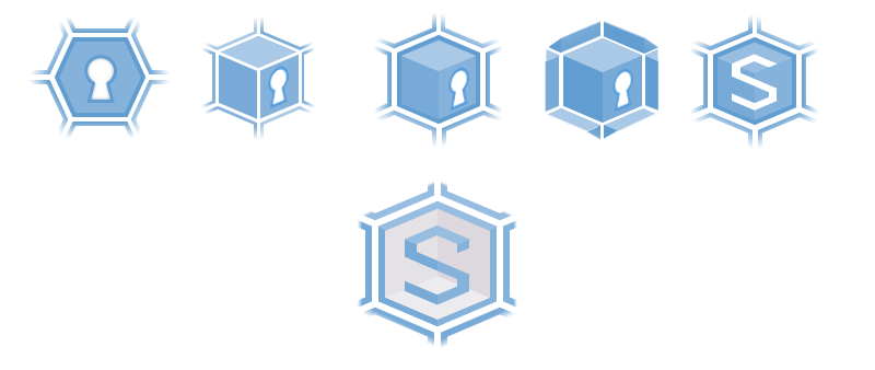
In the last one:
- The network is a 2D hexagon structure, centered on my honeycomb, which content is visible to me only.
- I cannot “see” beyond the edges of the first surrounding cells.
- My honeycomb is a 3D cube, carved inside the hexagon (from an isometric perspective).
- I can see freely inside the cube, but the S from SAFE is sitting on the 3 transparent front faces, and protects its content.
It is still not good enough. I think the main difficulty is trying to convey 2 opposites ideas: the connectivity of the network and the privacy of my information: isolation and collaboration. Anyway that’s all I can think of at the moment, feel free to tell me how to improve this, or to propose something else entirely! And if MaidSafe already has in mind a precise design, ok tell me to stop ![]()
15 Likes
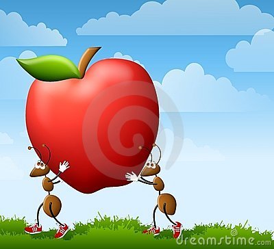
Ants carrying the fruit of knowledge. Knowledge being a construct of communication. Wrap the apple with a net/node overlay and put the acronym SAFE in the center. A somewhat cutesy visual tone could also help with public reception and slightly dampen the negative connotations associated with darknets. This is just something I grabbed off the net to convey the general idea. Something sleek sexy and not too serious should IMHO be the goal. Watcha think?![]()
2 Likes

I read this and agreed, then immediately pictured a keyhole in the middle of it in my mind’s eye. I scrolled down and low and behold you’d already done exactly that in your first pic.
Hexagon with keyhole… love it. Simple and clean, but also says a hell of a lot and gives feeling of security etc.
4 Likes
It’s amazing to me how you picked up that small icon in the blog (which was much smaller and fuzzier in the blog then you displayed here). You really have an eye and talent for this stuff! I love the final icon you created. Also, considering that the hexagon is a base geometrical shape of the torus, which has a lot of meaning, I hope Maidsafe uses your design.
4 Likes
To be honest the beehive image has been floating around for a while alongside the ant colony metaphor, I merely recalled it ![]()
The hexagon would make a good background theme for all maidsafe / safe app icons, and has surprisingly not yet been used to that effect in the app world. Maybe this is what maidsafe has in mind.
For the keyhole, the more I think about it the less I believe it emits a positive images. Outside of privacy-sensitive people, it can mean something to “conceal”, or “hide”. Initially i wanted the keyhole to look like a man’s silouhette, as in above posts, but I could not make something clear enough.
This is why I removed it in the end in favor of the S letter.
1 Like
Hiding and concealing things can also mean showing modesty, restraint, reserve, self control of the power and/or beauty within until trust has been earned enough to display or share it. Having boundaries is a good thing and helps to keep us safe. Those who don’t understand that yet are usually the ones who have had their boundaries continually violated and they’ve accept this as the norm. We should be cautious not to build on their immature views.
1 Like
@nowfeelsafer I really liked your designs and sharing your process line this. They are both interesting and inspiring IMO. Exciting to see!
Thinking about your reservations about the keyhole, and your mentioning the silhouette of a man made me think:
- two hands in a handshake, then
- two people holding hands, then
- a matrix of people holding hands but also connected by proximity of feet with shoulders (perhaps), and how this pattern might be another basis for the honeycomb matrix (not sure it could work, but hope you can see the visual of the idea
 )
)
Just something you sparked. Thanks.
1 Like
Keep it simple : ∆:ant:
2 Likes
This is very well done @nowfeelsafer . Can I throw out a couple ideas to vend into this simple design. All the below maintain your original shape key/keyhole
- The round section of center part becomes a globe -
- The center part becomes a person with the keyhole outer layer denoting an encryption tunnel
- The shape as-is could be maintained across all segments of SAFE but color, texture, theme, would all change depending on where the logo is used. Or the key would remain constant with the outer part The Encrypted Shroud / keyhole- changed for each segment.
IMO your design is perfect.
1 Like