Nice visualizations. What software do you use for that?
5 Likes
I KNOW that… thats what makes useable visualisation so challenging whether its a straight line or a circle in XOR space
I cling to the concept its a line of XOR distances from zero (your node) to some scary big number. But thats OK, cos scary big numbers allow us to do clever stuff.
corrections welcome
I was attempting to explain this to some folk in the pub tonight. After some discussion of prime numbers, privacy, Facebook being shite, the general consensus was that Celtic were going to hump the huns at the weekend. My work may not be done, but it certainly moved forward a wee bit. Stevie McIlwaine ( the scaffolder with the stutter) is going to try Mastadon and Josie (barmaid) wants to run a node on her Pi.
All in all a good night and I didnt miss the last bus home. ![]()
2 Likes
Thanks! Rhino with Grasshopper plug-in.
1 Like
nice article, shame about the formatting that makes the tables unreadable.
1 Like
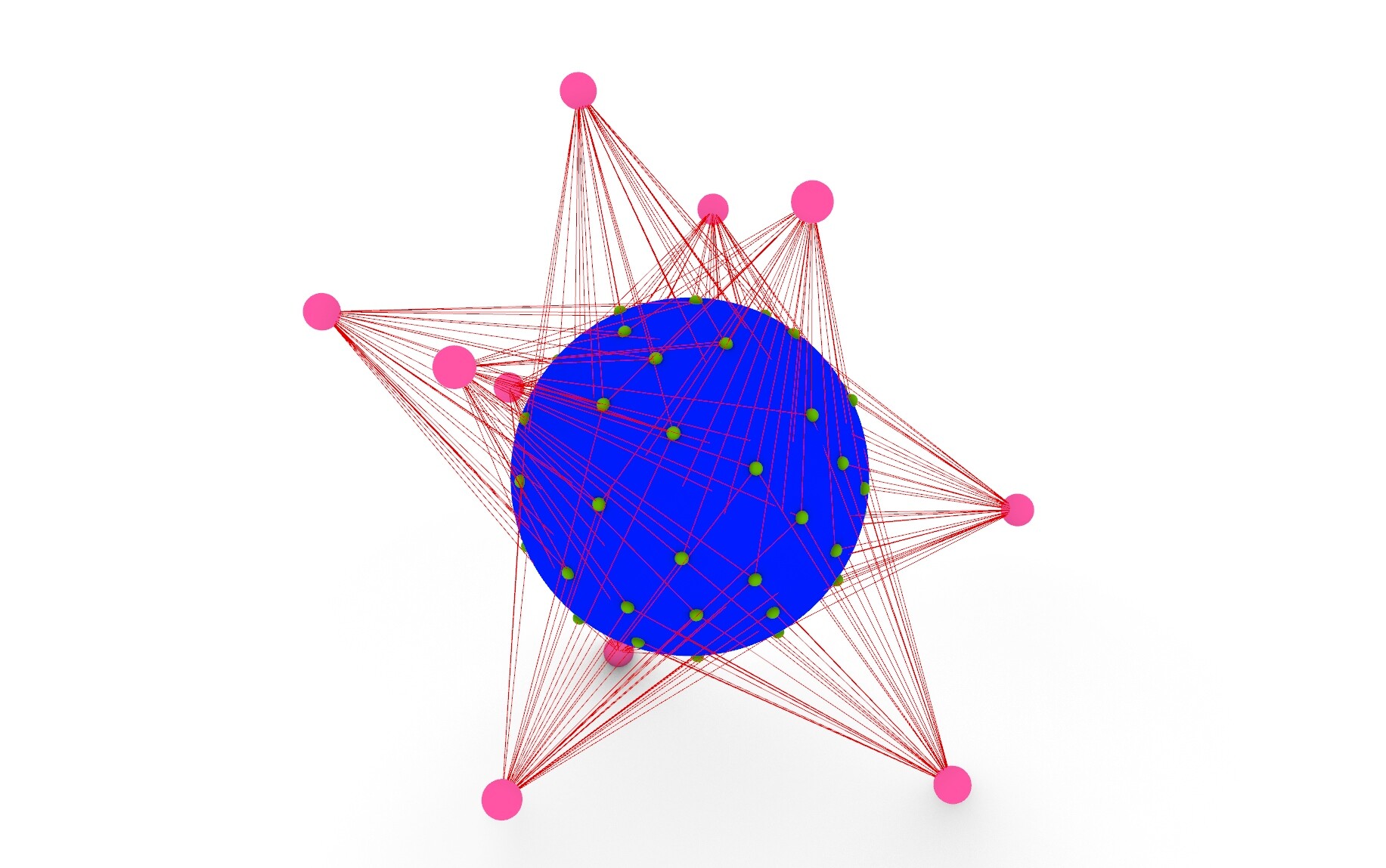
So how about this way:
Gray balls are possible node locations.
Pink balls are existing nodes.
Green balls are chunks.
Blue lines connect chunks to 5 closest nodes.
The sequence progress from minimal network with one chunk to a bit larger one. It gets messy soon though.


4 Likes
Too complex.
And also too few beads for the number of pink. The actual network would have like 10^50 white beads for each pink one for a world wide network. So for your diagrams you need more white beads and the pinks ones closer together.
Then have the chunks in on the same chain of beads. And then the 5 closest nodes left or right are the close nodes. Do like a zoom in and put a square around the the 5 nodes and chunk to show the close nodes.
This is a better representation
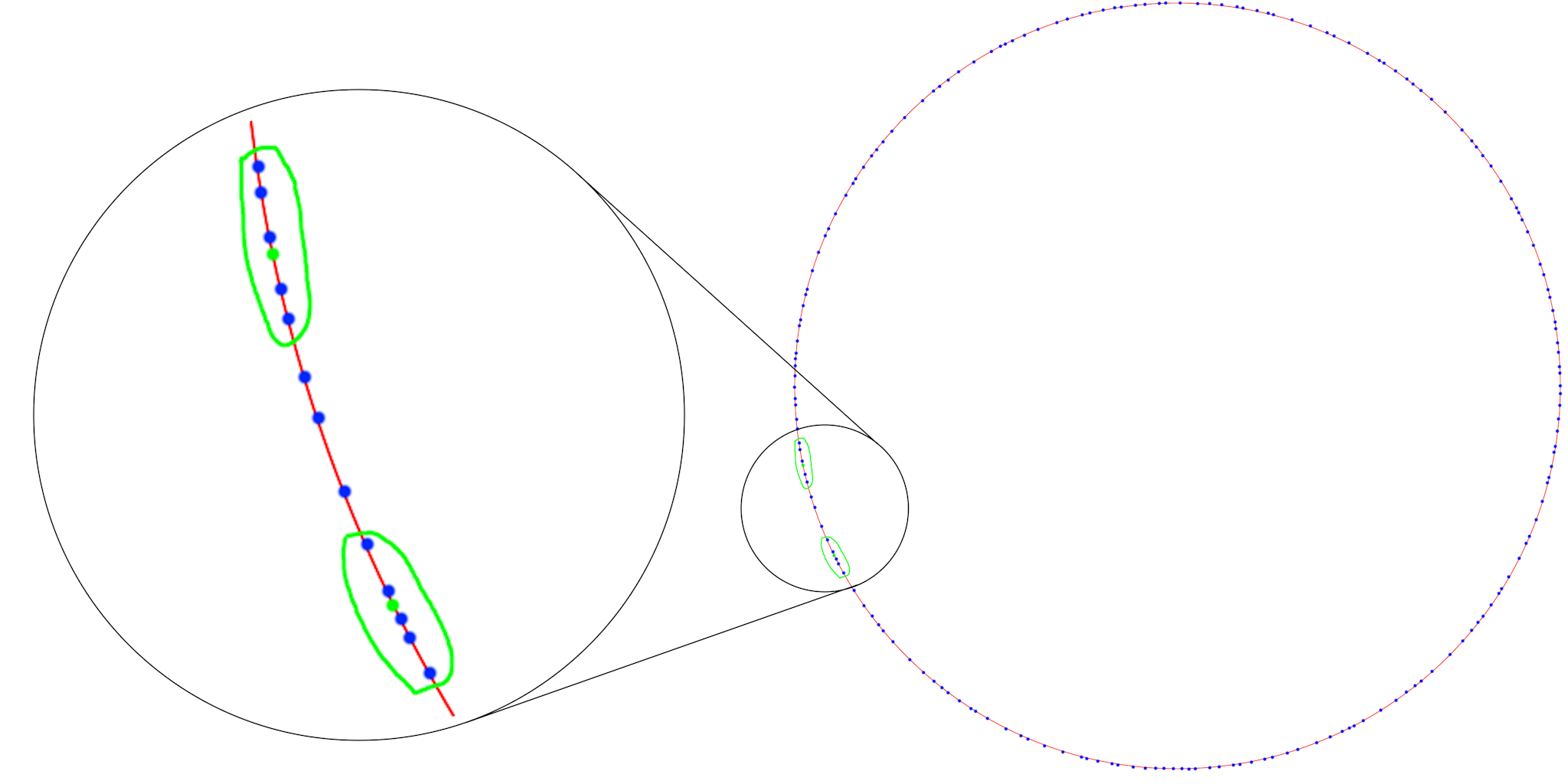
Only showing 2 chunks
There is something you could do to show the nodes and chunks are different by having two circles, one inside the other, but nearly the same size and show nodes on one and chunks on the other.
But its a number line that comes back on itself when max number is reached. So it is very appropriate to show both on the same number line (circle). The circle is only a number line.
7 Likes
Perhaps use different sized orbs (in addition to color) to help disambiguate and reduce space in the diagram. edit: I see you did for the chunks, but maybe for the white ones too.
1 Like
OK, got to think about it… And do some daytime work in between.
Thanks for your suggestions!
Another thing that is missing is that every chunk is actually different from each other. But that might be impossible to visualize in any scale.
You could also put the chunks in the middle - like a pool of data, not as accurate technically, but with the lines from the five nodes I think the idea is conveyed better maybe. The light blue around the data-yoke are the massive number lines.

2 Likes
There is maybe two things that we should try to visualize separately:
- The principle how chunks relate to nodes spread in XOR space. This is what I have tried to do so far.
- How it really works in closer to real scale.
I think they need to be separate diagrams. Both aims are difficult to achieve clearly in the same diagram. For example in real network every node is going to have several hundreds chunks. If you try to visualize how the close groups work with more than one or two chunks per node, it’s going to get messy, no way around that.
Just for the record, here is one more that I did before your circle suggestions. Thinking about earth and sattelites. It’s not good, but might lead to somewhere…
1 Like
You lose concept of how the chink address and node address is related.
I honestly think the idea of the number line (circle) and placing the nodes and chunks on it and circling the nodes close to chunks is the easiest to understand. And to zoom in give concept of scale of the network. Afterall this is to educate people, not map out a whole network in real time which is impossible anyhow.
4 Likes
@Toivo if putting chunks on the same line/circle as Neo suggests, you could make little loops linking nodes to chunk in the zoomed in bit for additional clarity.
1 Like
Its easy to understand when you only have nodes with 0 or 1 chunk. But when you have even four chunks per node, it looks a bit like this:

There is now 250 nodes on a circle and 1000 chunks, 4 chunk per node. Chunks are represented as a circles (without a center point). I colored a few of them.
This is just to demonstrate how the overlapping looks. I made this very quickly, so the random distances are not there, all distances are even.
3 Likes
Yea but its for demonstration purposes and as such you have only a few chunks. There is no way to illustrate thousands of nodes and chunks, it becomes just solid colours
Your diagram seems to be evenly spaced LOL Spirograph called and said nice drawing hehehe
3 Likes
At least not as a graph like this.
But how about a landscape with clouds above, snowflakes coming down. A few snowflakes magnified to show their differences. And below some sort of array of open boxes next to each other, where all the flakes ends?
… no, that loses the replication ![]()
Ok, now daytime job again…
3 Likes
Seems like it should be a good use case for generative AI - little risk, handling complexity.
Network visualisation probably needs it’s own topic?
3 Likes
We should ask Randall Munroe (xkcd.com) very nicely. He does a fine landscape and his snowflakes are exquisite. Knows his graphs too.
3 Likes